Hubspot (CRM Company)
Rebranding the resources ecosystem for 7M+ monthly visitors.
00

problem
HubSpot's blog drives 7M+ monthly visitors. But with a design from 2018, the site was misaligned with updated brand standards and underperforming on traffic and conversion metrics.
solution
Brought in to lead HubSpot's 2025 rebrand transition across the blog, resources, and conversion experience over one year. I executed quickly and precisely within their established design system across high-traffic surfaces.
Context:
At HubSpot I worked across dozens of design tickets over the course of a year. Most of that work is either private or not yet live. This is the one project I can fully showcase.
Impact:
-Contributed to a rebrand affecting 7M+ monthly visitors
-Worked across blog, resources, and conversion surfaces over the course of a year
-Unified two overlapping sites into a single resources ecosystem
-Redesigned and standardized the full CTA component set across multiple page contexts
Most work remains private. Performance data was not accessible at the time of delivery. In hindsight, tracking post-ship metrics is something I would prioritize from day one.
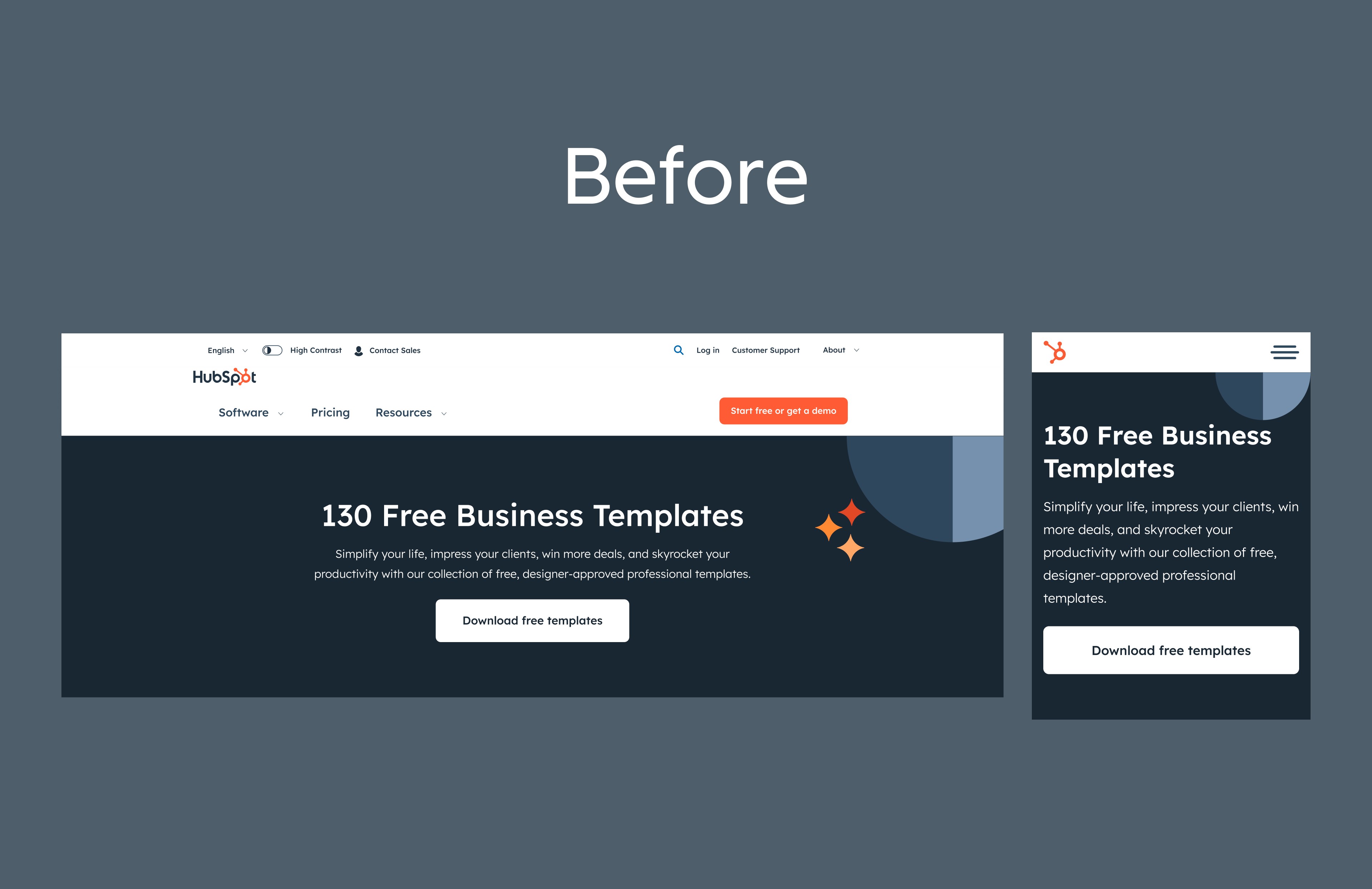
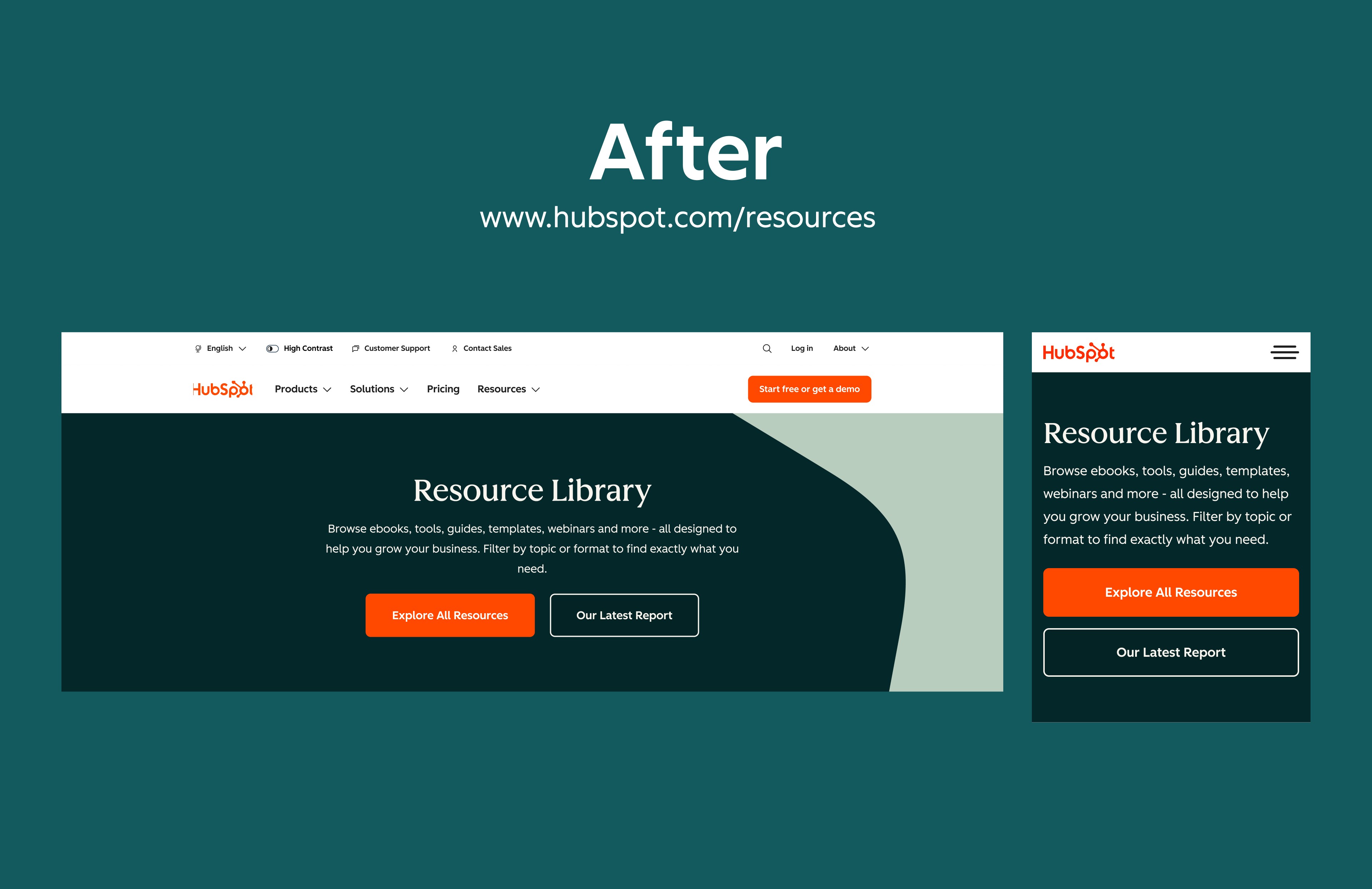
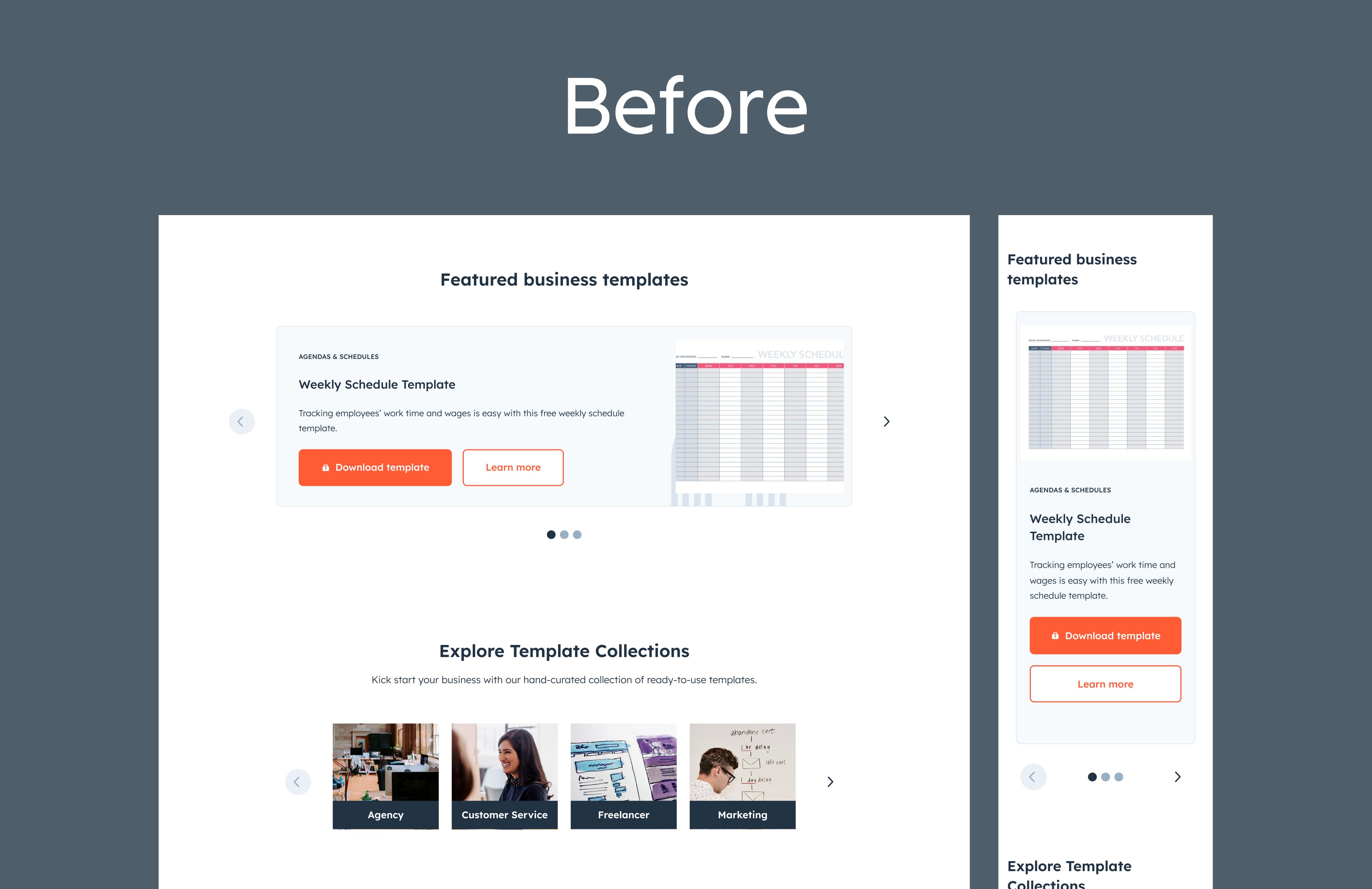
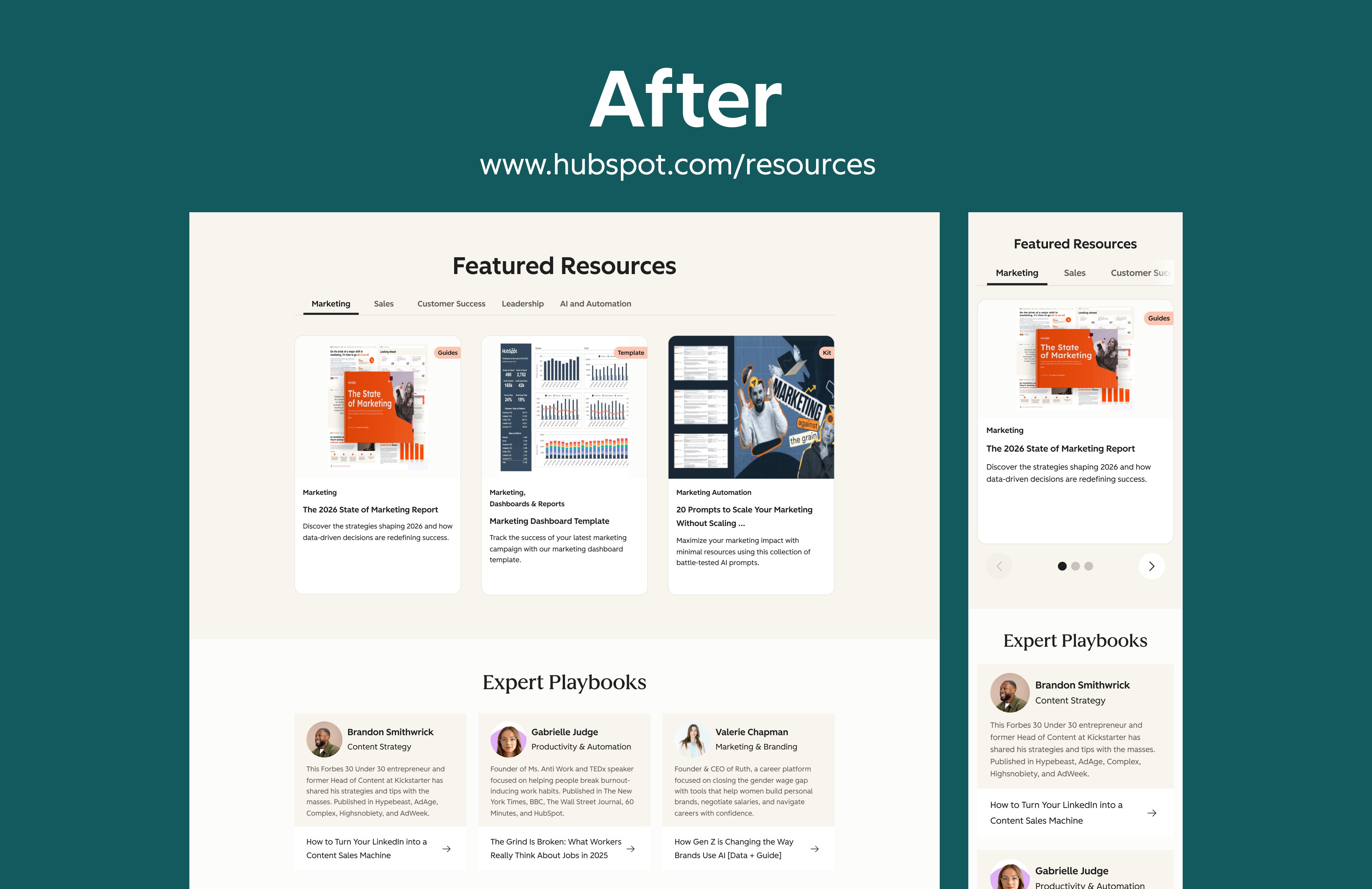
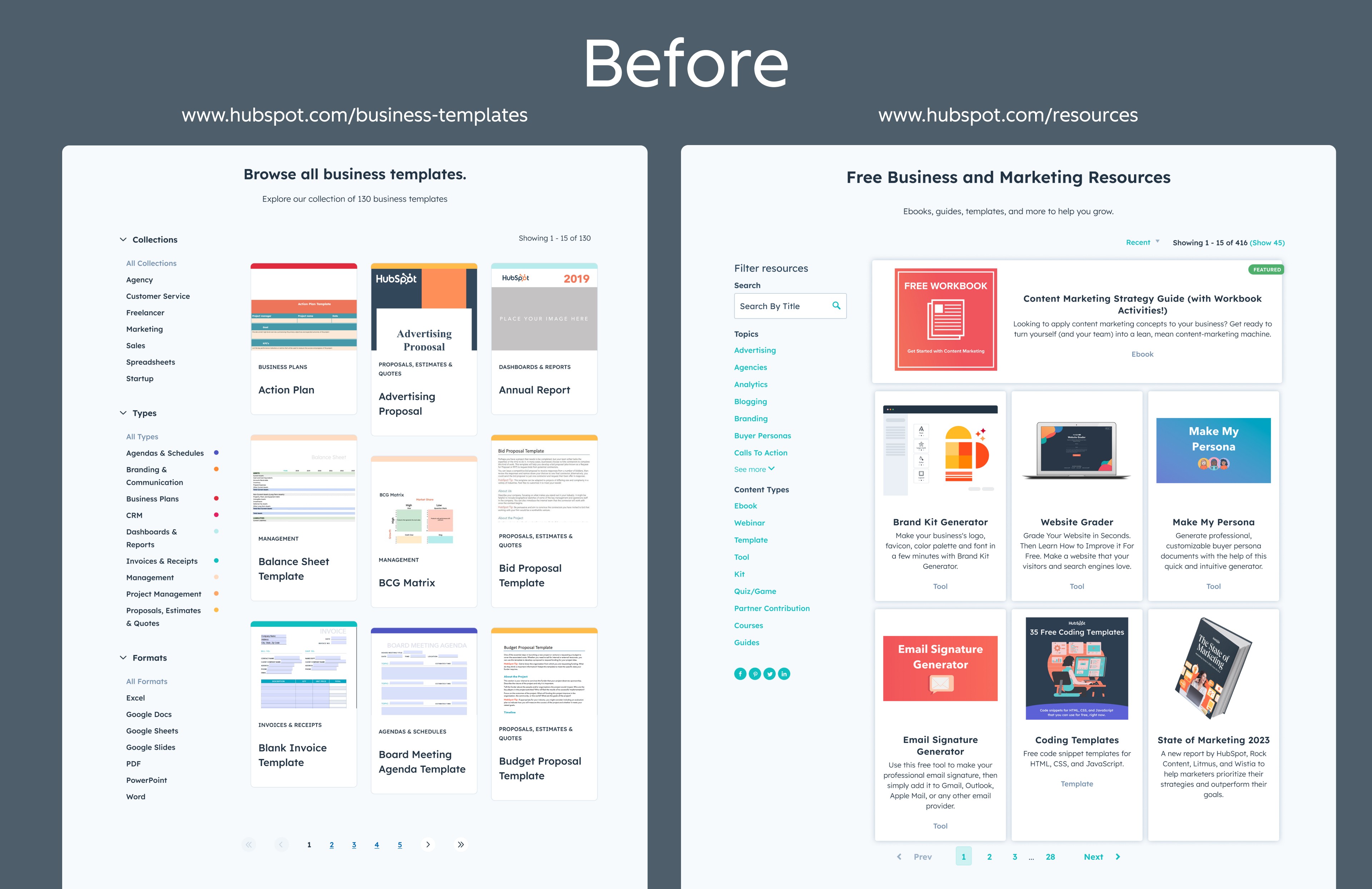
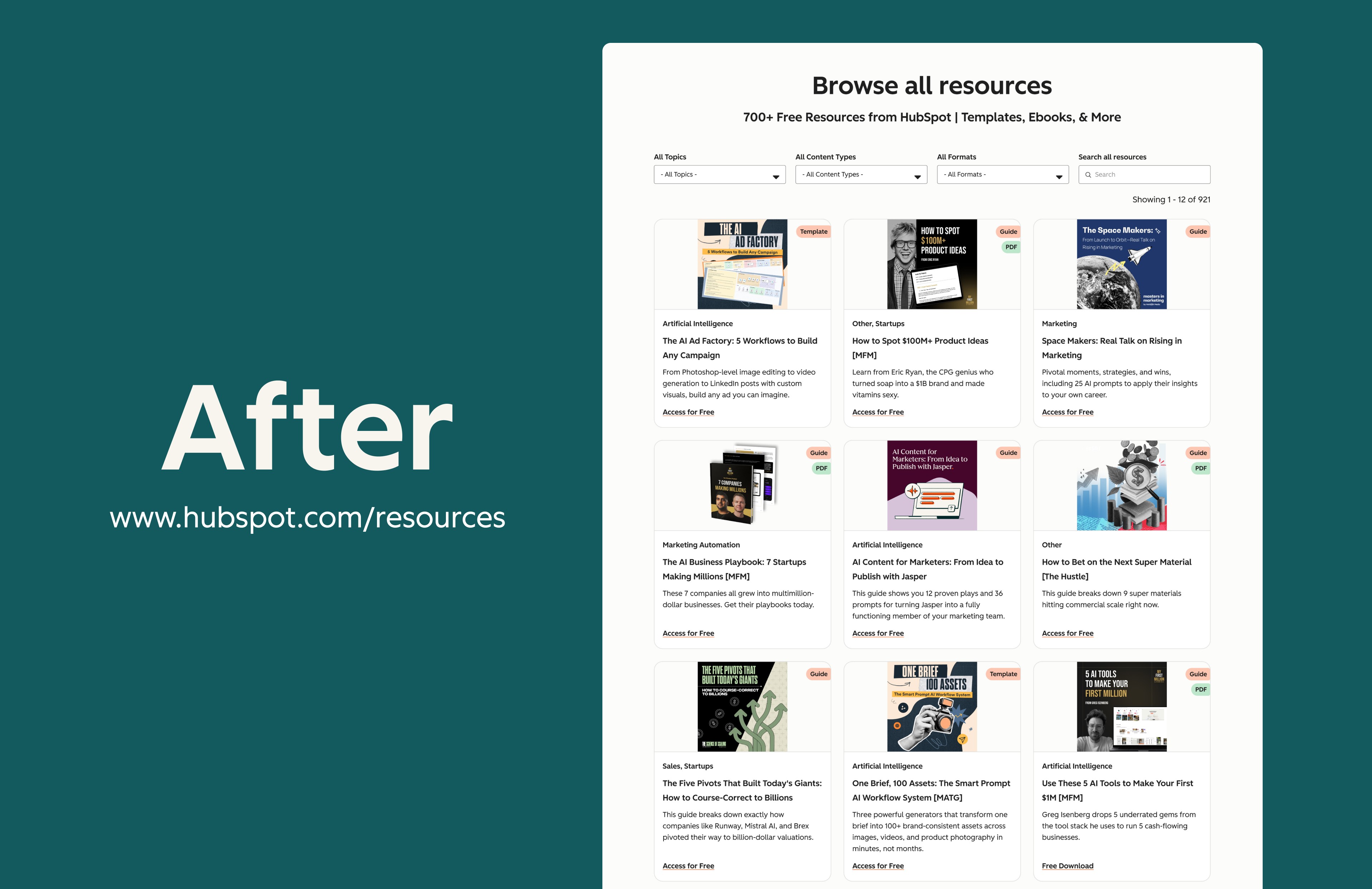
One of my projects was unifying two overlapping sites, hubspot.com/business-templates and hubspot.com/resources, into a single Unified Templates Library.
I personally owned the Header and Hero, Featured Resources, Resources grid, and CTA components across a page serving millions of monthly visitors.
The Header and Hero:
The original header had off-brand typography and a buried CTA untouched since 2018. I rebuilt it to the 2025 brand system, tightening hierarchy and surfacing the primary action. A first-time visitor should immediately know what the page is and what to do.
What I'd measure: scroll depth past hero, CTA click-through rate, bounce rate.
The Featured Resources:
High-value resources were treated the same as everything else. I redesigned the section to create a clear editorial hierarchy, making featured content feel curated rather than dumped. Aligned with the new brand's editorial visual language.
The Resources:
The existing grid was visually inconsistent and off-brand. I rebuilt the card component system from scratch, standardizing spacing, type, image treatment, and tag taxonomy. The result improved scannability and reduced time-to-find for users.
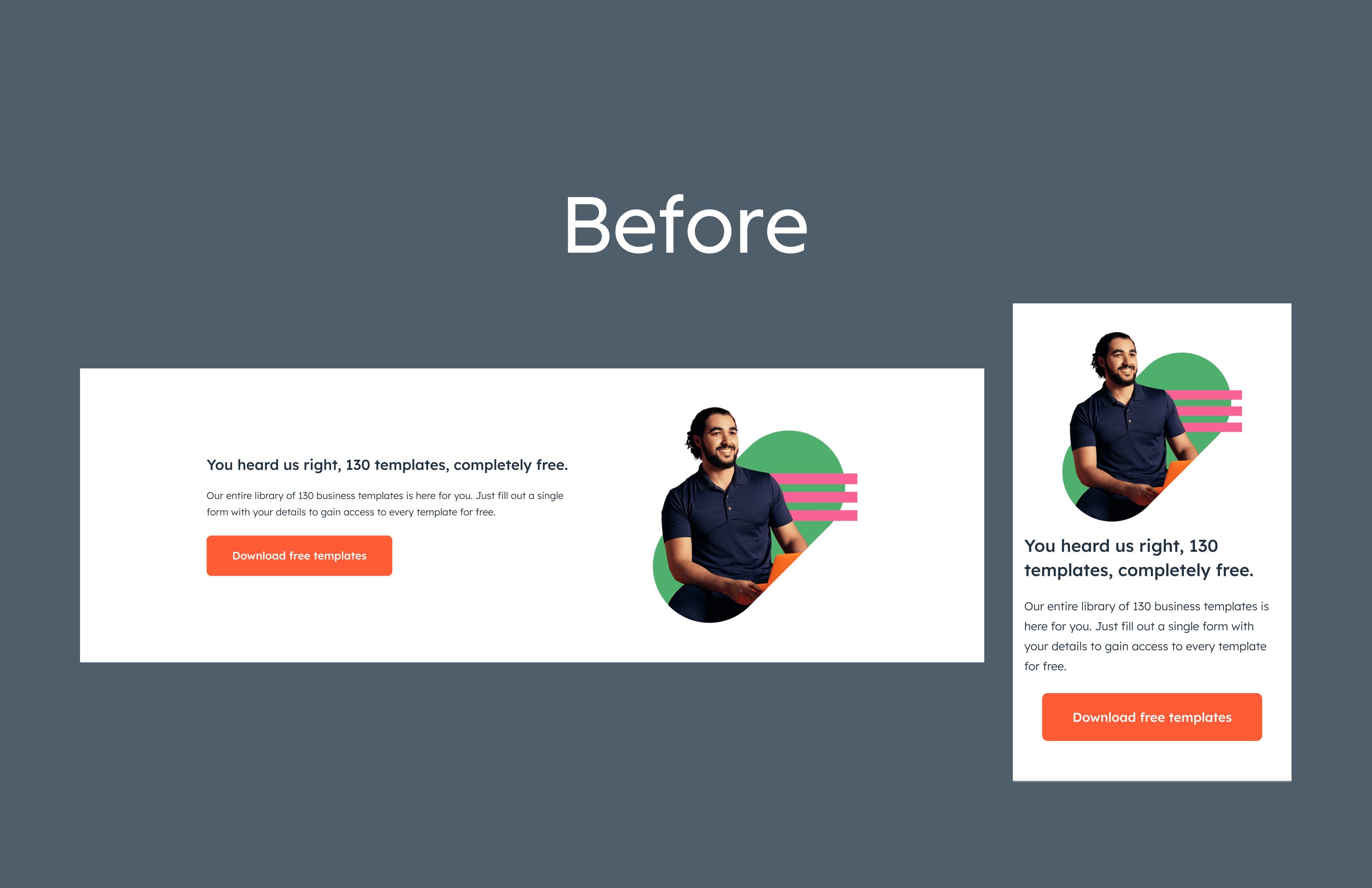
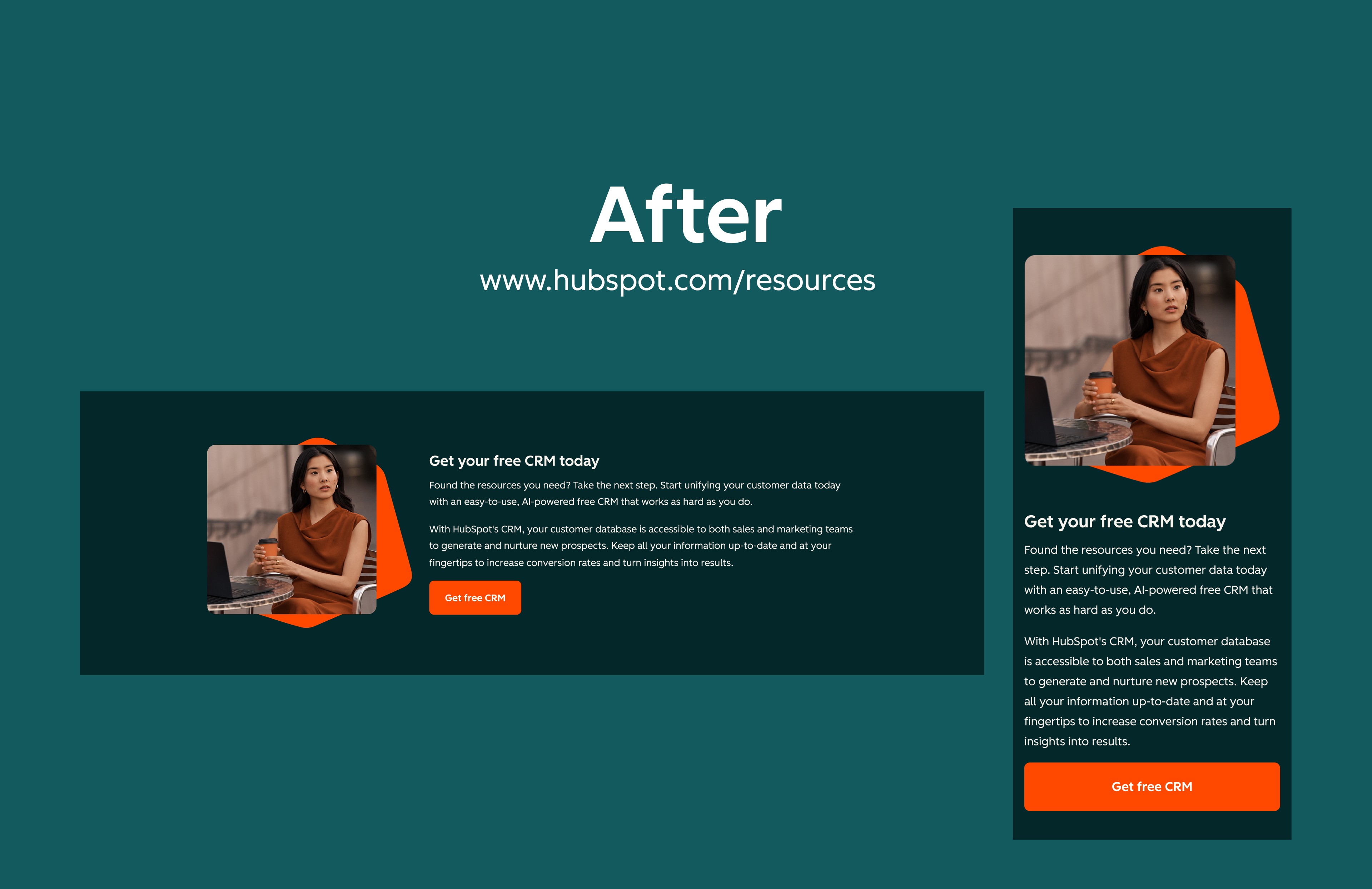
The CTA:
CTAs across the blog and resources pages were inconsistent in placement and visual treatment. I redesigned the full CTA component set across three contexts: inline, end-of-page, and sidebar, each optimized for its specific conversion goal.
Reflection:
HubSpot taught me how to ship precise, high-quality work at scale inside a mature design system. In hindsight, I would have proactively tracked the performance of what I shipped rather than treating delivery as the finish line. That's a habit I've carried into every project since.
year
Jan. 2025 - Dec. 2025
interface
Desktop / Mobile
tools
Figma
category
UI/UX
01

02


